Dealing with large scale data is one aspect of web development that has seen a meteoric rise lately. It leaves devs with a problem they rarely encounter - having too much content. Most designers and developers I know spend quite a bit of time prying information out of clients and utilizing a few layout tricks to make it look good. Dealing with "big data" leaves you in quite the opposite situation.
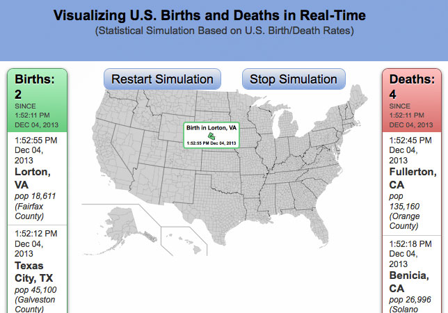
While doing some research on a recent project I ran into an interesting subset of data. Researcher Brad Lyon created a beta project titled Data Visualization Births / Deaths in Real-Time that displays a simulated, real-time graph of births and deaths in the US. While this information might come off as a little depressing to some, it certainly does a great job of utilizing a scientific approach to tap into a deep psychologic issue... that being our own mortality. Click the map below and take a look at some Google Drive hosted data that runs a simulation pulling US data along with associated religions.

If you'd like a less filtered view, this post also covers data visualization births / deaths on a worldwide scale. This data is obviously a simulation since pulling real world stats would require a unified data source (and good luck compiling that ;), but much credit should be given to one of the leaders in the data visualization field - Brad Lyon. It should also be noted that on this particular data set, he worked with Bill Snebold. Although it may generate a bit of anxiety, viewing this data visualization births / death simulation allows you a unique perspective and at the bare minimum is some interesting data.

